W5
Design motion graphics for numbers
Adapting Animations for Social Media
All the videos are edited specifically for social media, where I focus on motion graphics and effects like glitch and cool transitions. I love using techniques like repeated frames and quick cuts, which are great for creating dynamic and eye-catching reels.

-> follow my IG: Carol Wang(@carolwang.work)
Social media requires short and engaging content to grab attention quickly. So, I add some edit for these countdown shots.
BTW, the final animation won’t be the same; it will have a different style tailored to its purpose.
I’ve realized that animation in motion graphics depends heavily on where and how it’s used. Instead of crafting a single frame for one purpose, I explore multiple uses by rendering a few frames and editing them in various creative ways!!
Part one – the first countdown
When I animate motion graphics every day, I think about creating different transitions for each number. Sometimes, I feel stuck trying to come up with unique and playful ideas, like morphing or color changes. What I learned from this project is to focus on each number’s design, including its outline, shape, and color. Connecting elements between two shots became the key spirit of the entire countdown animation.
Most importantly, I reminded myself not to rely on Pinterest for inspiration, as it might influence me too much. I had already seen plenty of great work during the research stage of this project.
At this stage, I aimed to keep everything as simple as possible, trusting that simplicity would lead to unique and unexpected motions.
Number10
Make it as simple as possible !
I love the soft gradient color.
Number 10 was my first attempt at 3D motion graphics during the summer break. At first, I kept everything simple to focus on a clean and neat visual style. I experimented with combining textures but softened them with gradients to balance the overall look.
This approach ensured the iron texture didn’t feel too bold or overwhelming, maintaining harmony across the design. It was a great learning experience and helped me refine my style.


Number 9
Number 9’s composition is the fun one. It gave the ball, the main focus, a space and playground to move around.
I can animate the ball surrounding the background objects, which brings more possibilities for how this motion graphic can be.


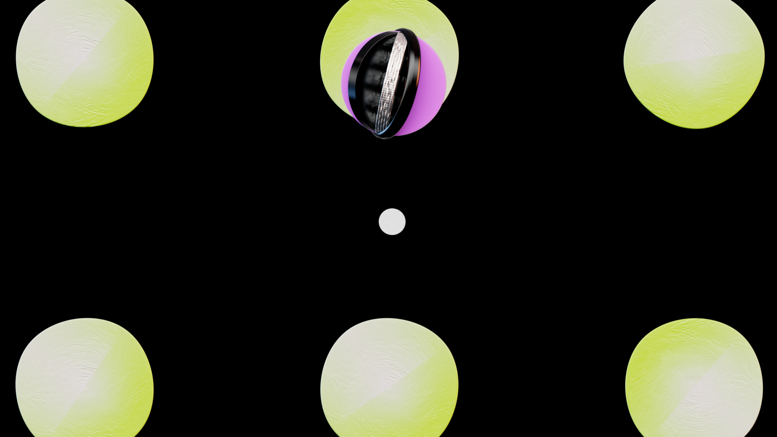
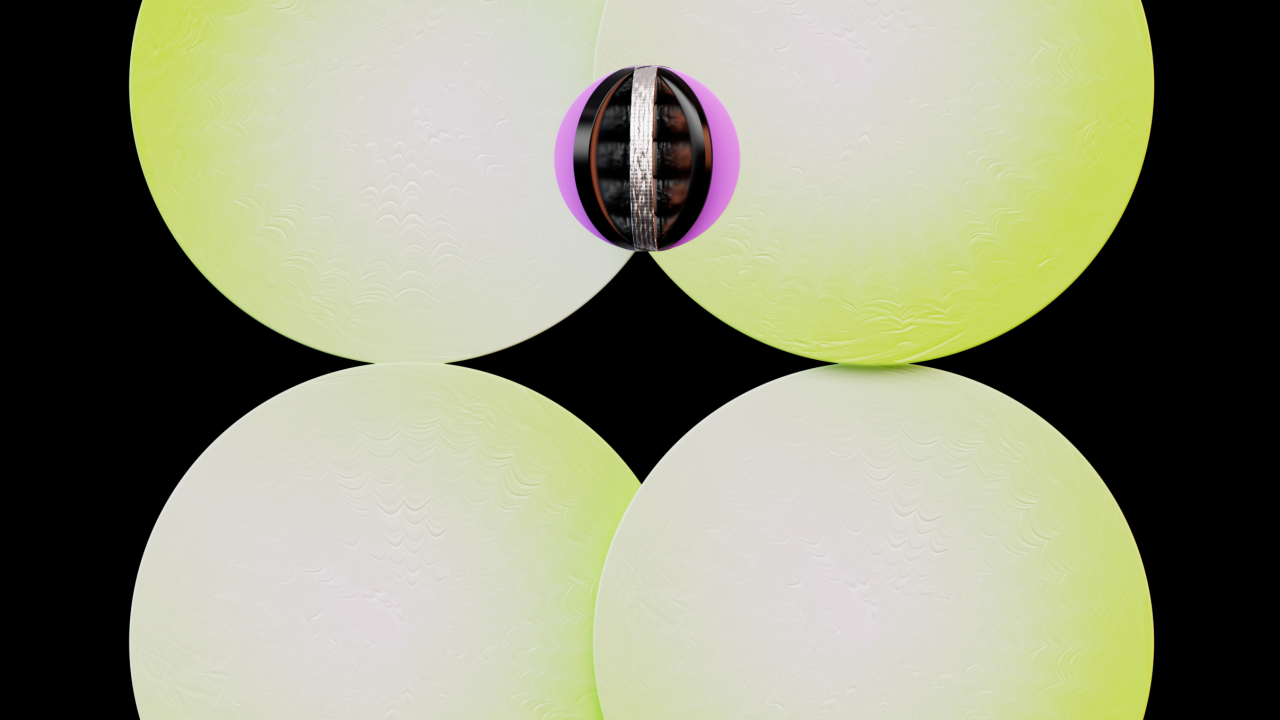
Number 9 was the second piece I created and also the first transition for this animation project. I wanted the transition to guide the audience, so I used a ball to lead into the formation of the number 9.
To maintain consistency, I incorporated the stripe element from number 10 as a decorative detail. This tied the visuals together and ensured a cohesive style throughout the animation. It was a fun challenge to design a smooth and engaging transition.
Everything is a bouncing ball!
The circle is the main focus and a guide for whole visual in the transition.


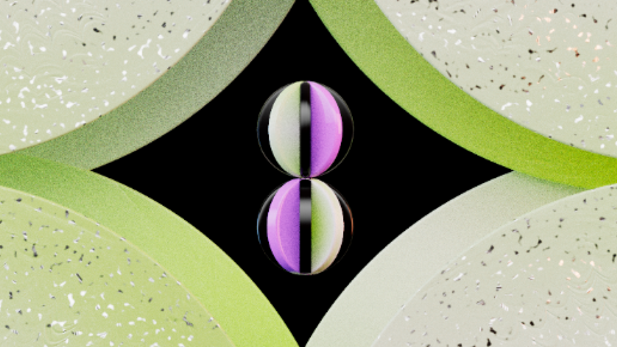
Number 8
In my mind: maybe add sparkle like start elements?

Number 8 is one of my favorites. I love how the ball transitions from slow to fast movement, following the principles of animation: anticipation and follow-through. I focused on how the ball falls and bounces to make the motion feel natural and dynamic. This added a playful and realistic touch to the animation, making it more engaging.
As you can see in the BTS GIF, I keyframed everything in C4D, and it was so much fun to play around with shapes transforming into one another.
I love the transition!
Number 7
Number 7’s pattern is like a digital carpet. The pattern is so cool to look at!

Digital Pixel Style for Number 7
Futuristic digital feel?? Maybe
- Designed Number 7 with a digital pixel style, moving like gaming pixels.
- Loved how the pixels form and resemble the shape of number 7.
- Inspired by the background song, adding a glitch effect for a cool, digital vibe.
- Combined movement and style to enhance the overall futuristic feel.
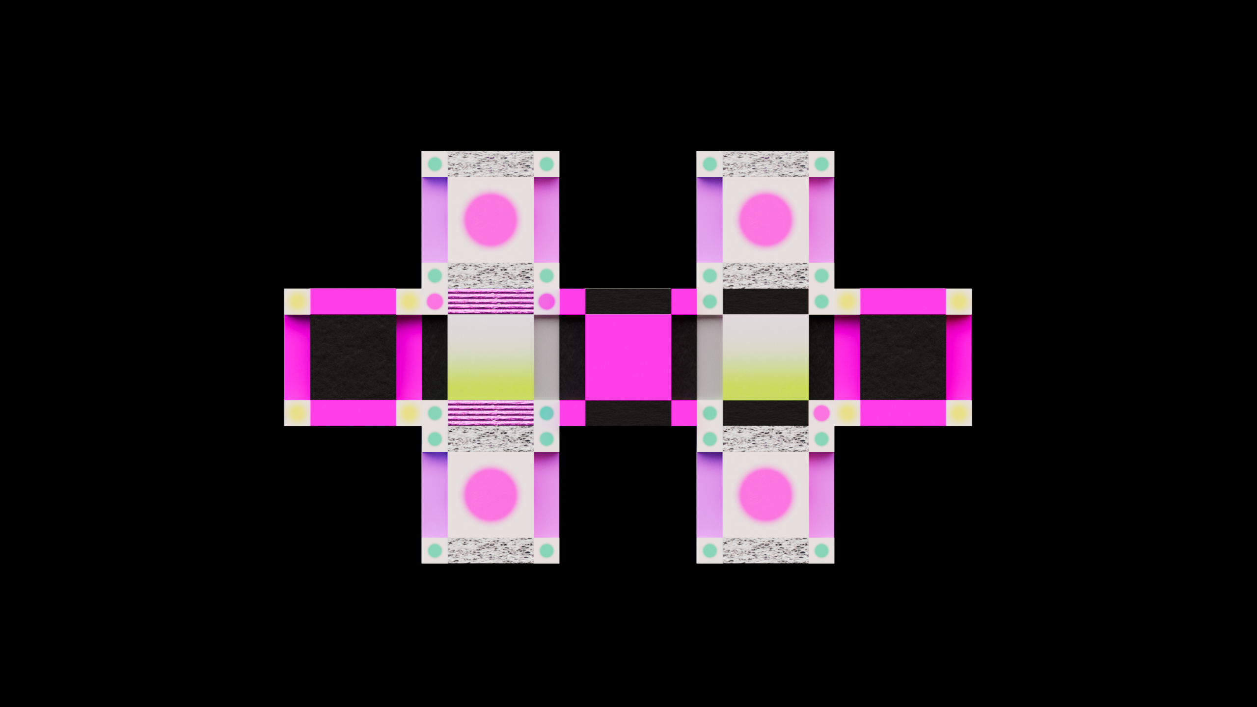
Design system / Guideline
I created a design system at the beginning of this project to ensure consistency and save time when applying textures to 3D models.
- Design System: Ensures consistency and saves time in 3D modeling.
- Color Palette: Vibrant, contrasting, neon tones for a youthful and energetic vibe.
- Textures: Silver, paper, glass, iron combined for a tactile, layered feel.
- Inspiration: Bold advertisement aesthetics with a celebratory New Year theme.
- Visual Identity: Cohesive, dynamic, and unique animation style.
- Mood: Fun, vibrant, and joyful, matching the New Year celebration.


This mix of colors and textures creates a bold and cohesive look, making the animation stand out while staying fun and festive. The textures add character and make the project feel unique. This approach made the workflow easier and encouraged creative ideas, resulting in a dynamic and exciting animation—a true New Year celebration!
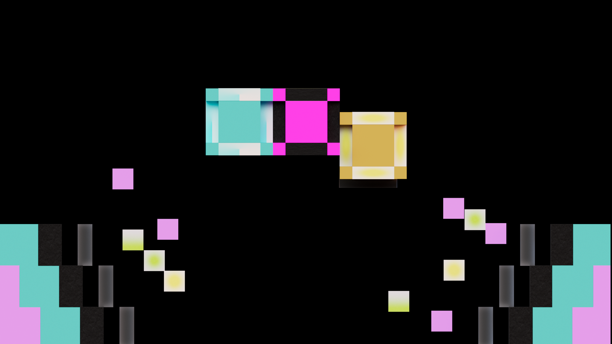
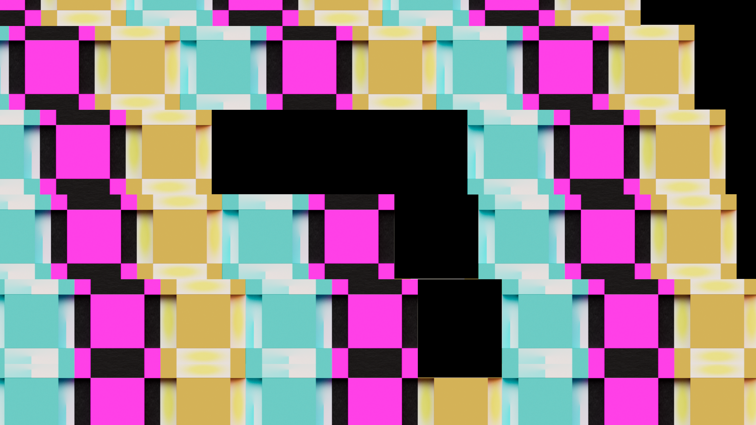
Color testing
- Tried many colors to see which ones looked best.
- Tested bright and soft colors to make the design stand out.
- Changed how strong or light the colors were to make them pop.
- Checked how colors worked with textures and lighting.
- Focused on making the numbers and shapes easy to see.
- Kept testing until the colors felt just right.
- Chose colors that are fun and catch the eye.


Number 2 is like flowers surrounding the main model.


Number 4 was the most challenging part of the project. I wasn’t satisfied with the final look, so I tried over 20 different renders to find the coolest vibe.
I ended up liking the half-white, half-black background because it complements the concept of having two countdowns without making them feel identical. To ensure the design stayed consistent yet playful and special, I tested numerous variations.
Each version was carefully aligned with the overall design guideline while exploring creative differences to make the animation stand out. This process allowed me to push the boundaries and refine the final look to perfection.
Additional elements
Planning Additional Elements for the Intro
I’ve been considering adding extra elements to the animation, like a clock, a phone displaying the time, or a calendar, all of which can serve as icons for time.
My plan is to include these elements in a short intro sequence before the animation begins. This would act as a calm, waiting moment before the main show starts, especially since the music kicks off at a quick pace. It’s a way to set the tone and give the audience a moment to settle in before the action begins.
